From visual to practical
My journey with linux started around 2008 when I first got my hands on a Ubuntu live cd that came with CHIP magazine. I was extremely curious of what it had to offer as software but back then I lived in a dorm and I did not have a portable computer. The dorm had a computer room with two computers on the ground floor. Me and my friend used to leave the window open to sneak in at night (insert mission impossible theme here). I would boot up the live cd and go through the software center to explore the available programs while my friend would play WoW on private servers.
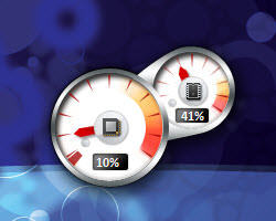
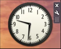
When I got my first laptop (An MSI Wind U100 netbook), it was around the time Windows 7 was released to the public. It was such a fresh leap from XP and Vista in terms of UI. The Aero effects were pleasant and vibrant. I used to set up desktop widgets like CPU and RAM usage meters and the analog clock. I always tried to set them up perfectly aligned.
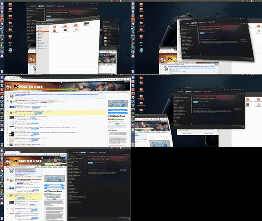
My curiosity had no direction and I ended up obsessing over having a good-looking desktop and cool effects, which were doable without dealing with technical details. Meanwhile, I wanted to switch to linux and started looking for the best distro to make the jump. After exploring different distros I stumbled upon the "Ubuntu Ultimate Edition" by TheeMahn. The distro offered pretty much everything in one package which got me hooked as a potential hoarder. Also seeing the possibilities compiz brought blew my mind. I used that distro for years.
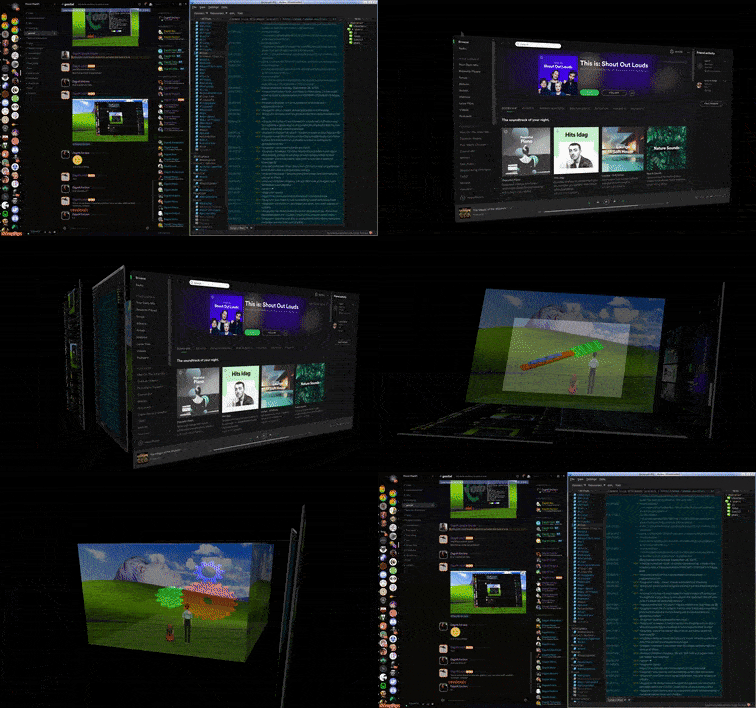
After switching to linux permanently, as every other linux desktop user, I found the functionality of widgets in conky. The extensibility of conky was both great and a bit scary to me. Since I'd never dabbled in scripting before, I couldn't really do anything with it. Instead, I used configurations others put on the internet.
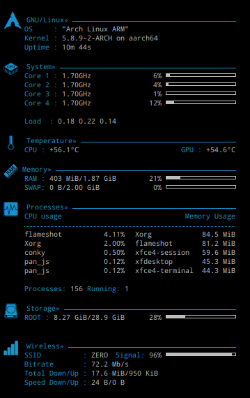
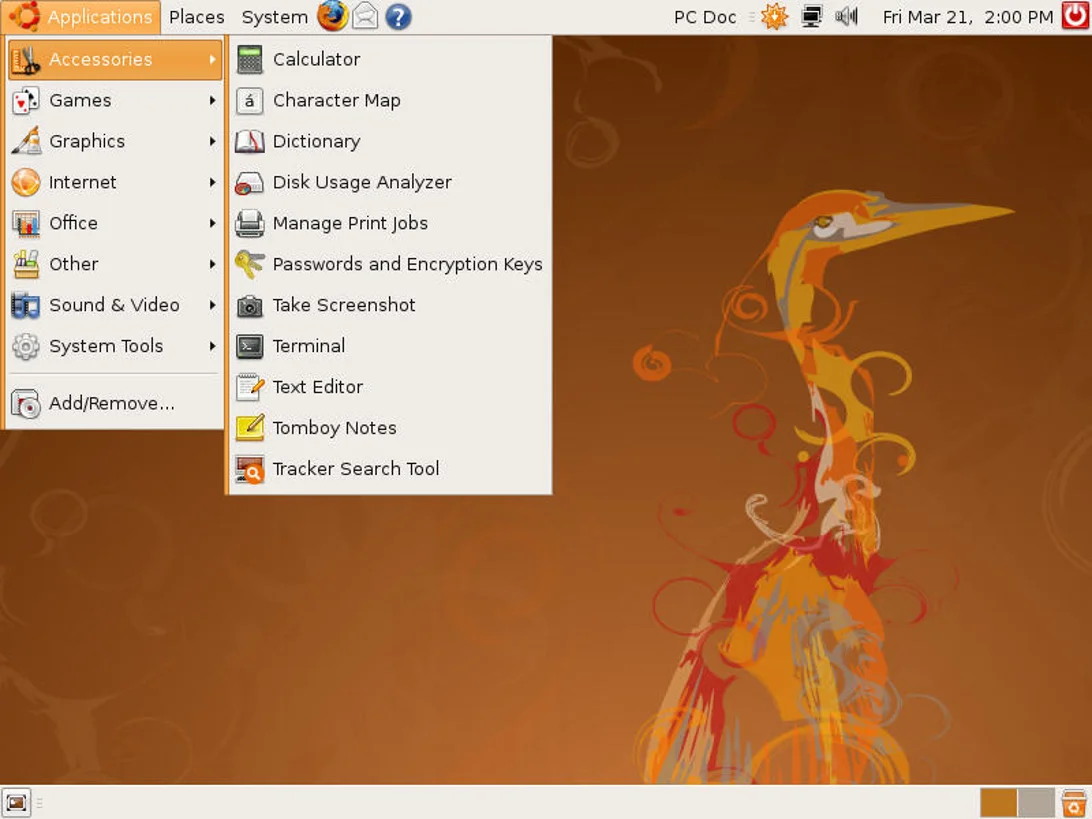
Around the time I was using Gnome 2.6 as my desktop environment. It coming as the default DE with Ubuntu and the customization capabilities were convenient enough that I did not really give much of a chance to other alternatives like KDE or Enlightenment. Then Gnome 3 happened. When I tried it, the good feeling of eyecandy quickly subsided with the lacking customizability. It did not feel like linux to me, so I started looking for a new DE.
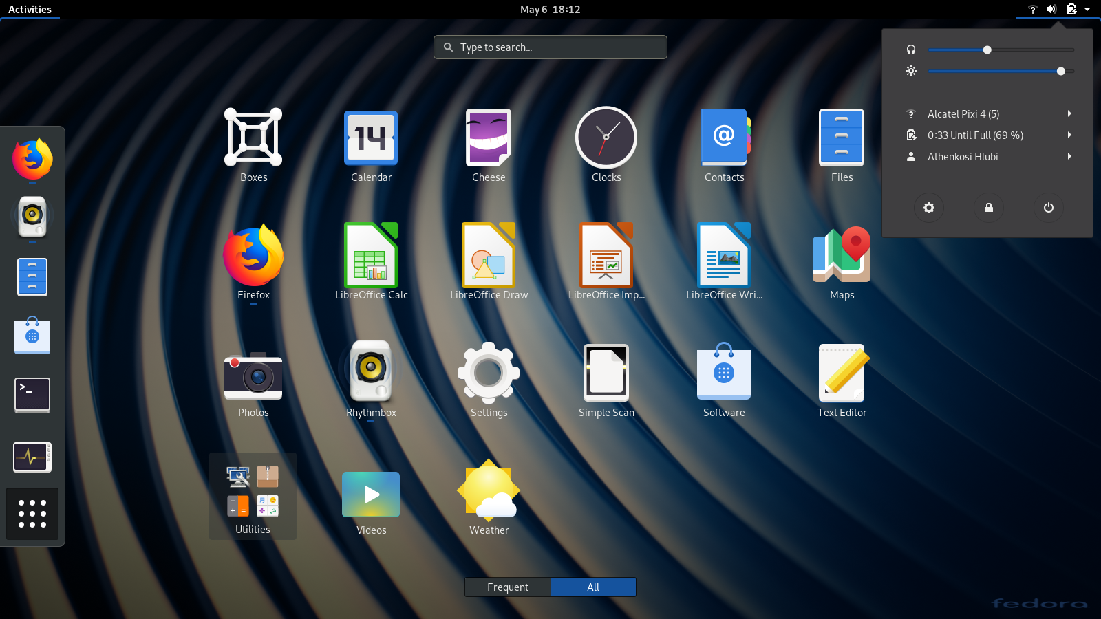
The feeling about Gnome 3 turned out to be mutual, hence MATE desktop environment was developed as a fork of Gnome 2.6. I kept MATE as my ain DE for a long while.
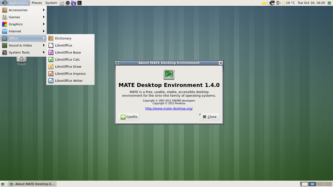
My next stop on pretty and customizable DEs was KDE. KDE 4 was said to be usually a buggy mess and when KDE 5 hit release candidates, It looked extremely promising in terms of visuals. I remember changing the cursor theme to Pulse Glass as the first thing after installing KDE.
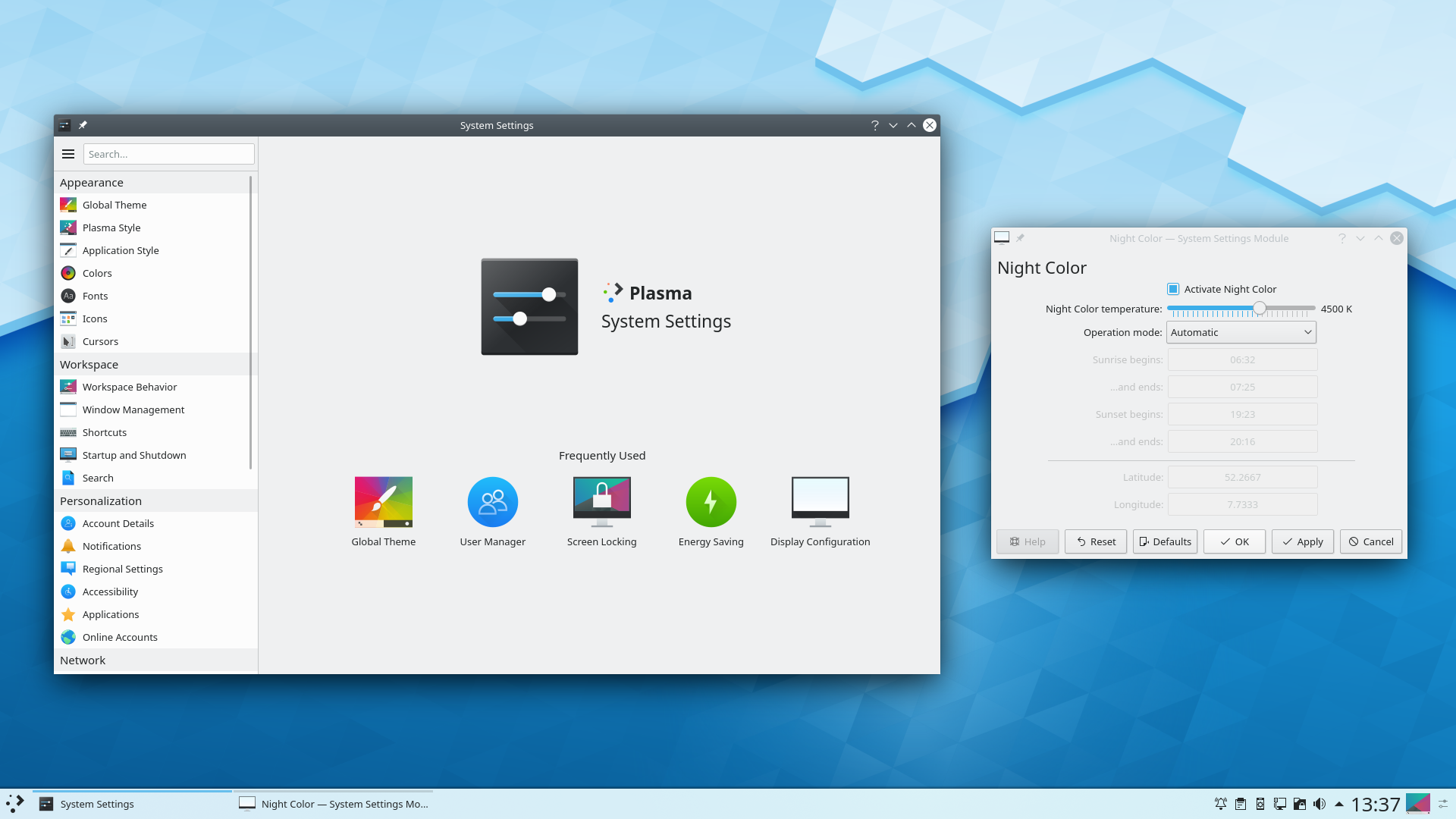
I tried KDE 5 and it pretty much clicked in every way. I kept it as my main DE for a few years. Contrary to how it was perceived as buggy and unstable, I had very few problems with it; even though I started using it in RC versions. The application suite that came with KDE was also complete, deeply customizable and slick. I was extremely satisfied with the whole package.
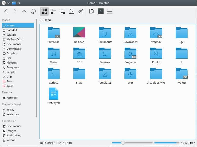
Meanwhile, I was getting more and more into the poweruser territory. My workflow started involving the terminal and dealing with networked applications and systems. My requirements as a user shifted heavily towards portable and light environments. I felt overwhelmed by the sheer amount of capabilities and applications that were installed on my system that I rarely used. I wanted to have a system that provided what is necessary. This would allow me to keep it simple and keep my installation light and reproducible regardless of hardware.
My interest towards practicality resulted in the exploration of terminal applications. Bash, zsh, vim, tmux and many others followed while I was trying to get comfortable with editing config files to set things up. At first I had a hard time understanding all the different options so I went with available frameworks like oh-my-zsh, spf13-vim and spacevim. These projects pack every extension ever into one package and make it possible to install everything with one command. At the time this seemed like the answer; However, as time passed I realized that I made the same mistake as before. There were just too many functions that I would never need. This also presented another problem: Since everything came preconfigured, there were a ton of shortcuts to learn and integrate into my workflow. The configuration files were humongous. In case any problems occurred, I did not know where to debug. If I wanted to change a shortcut, there was a good possibility of a collision.
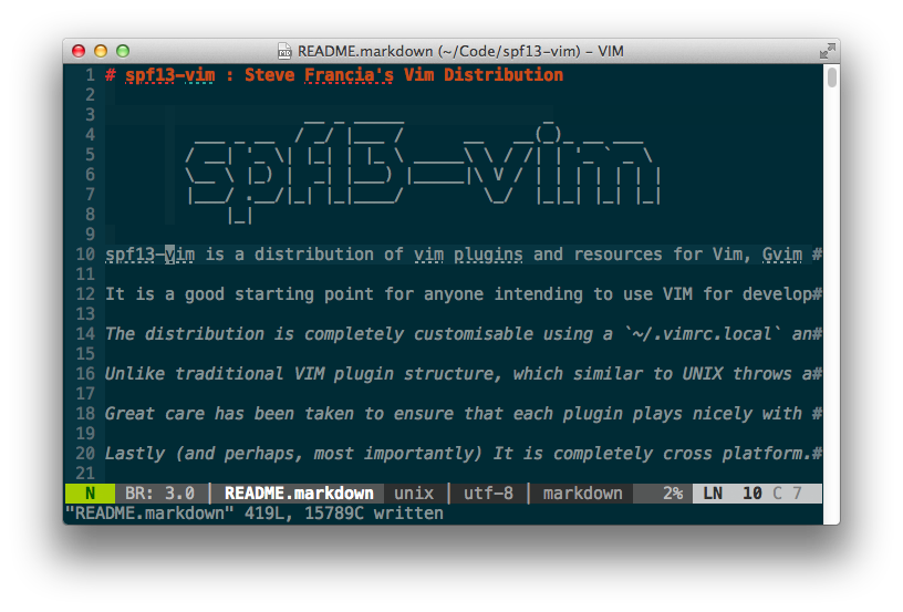
Even though I knew these problems were affecting my productivity and workflow potential, I stuck with frameworks for a while. Only recently I said enough and started getting rid of these overengineered extensions and writing configurations from simple templates. After getting rid of the complexity and focusing on what I absolutely need, I found the ultimate customizability (not in visual but in practical sense) in these applications. With that, I was ready to put the final nail in the coffin.
Finally, I made the switch from KDE to i3. With that, I felt that I officially embraced the value of practicality. I felt that I was now using the computer as a tool, not a scenery. Even though I was big on configuring the environment prioritizing visuals for years, now a wallpaper didn't even seem necessary to me. Of course I did set up a wallpaper, fonts and a colored bash prompt but these came after functionality.
As I'm writing this post, I'm looking at a screen with very little clutter: i3wm (without gaps), an (almost) uncustomized i3bar reporting system resources, an Alacritty window and Vim with my selected plugins running on it. I love having very few dependecies with my tools. I can have this setup on a very broad spectrum of hardware without hiccups and my terminal and graphical environment consists of broadly available tools so I can set them up on any remote or local system I want. It's the freedom of not having to install a bunch of packages and having to rely on esoteric or intricate software that makes me feel great and productive. It's all set up the way that I can leverage. I honestly don't miss having aesthetic interfaces at all.
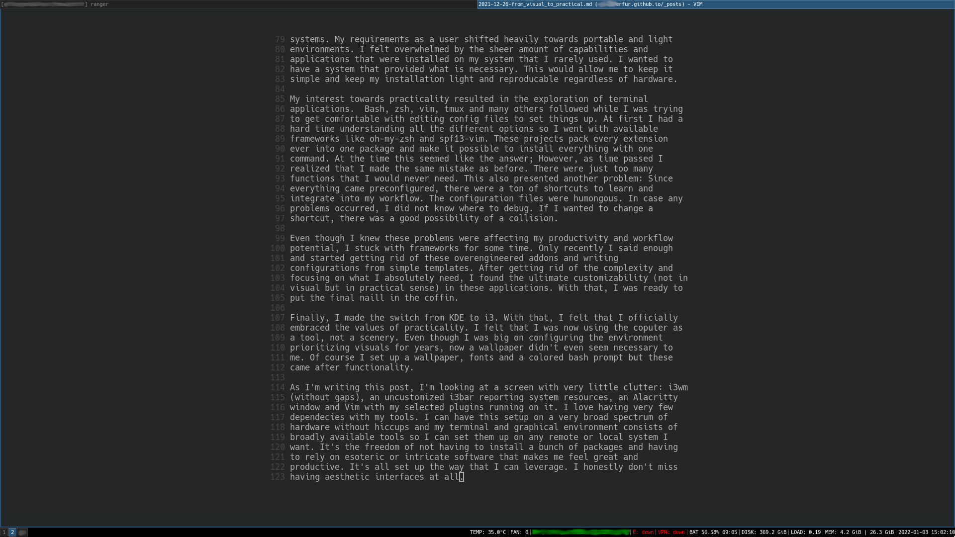
This post served as a retrospective on how I used my computer. I only wish that I kept screenshots from my previous setups, all of the images except the last are taken from google. Nevertheless, It felt nostalgic and fulfilling to see the changes over the years. I'm also publishing this post as a welcome to 2022.
So, happy new year!